


Web Design, Hosting, and SEO Blog
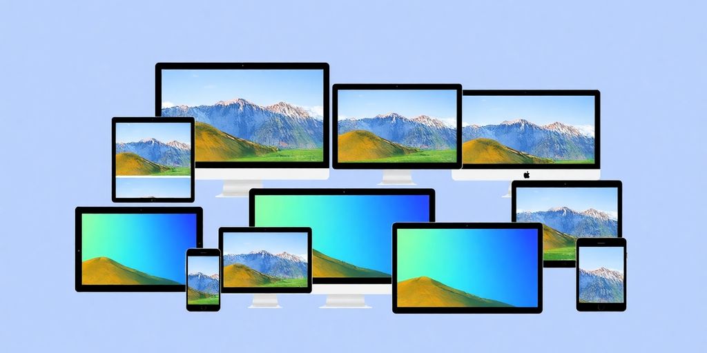
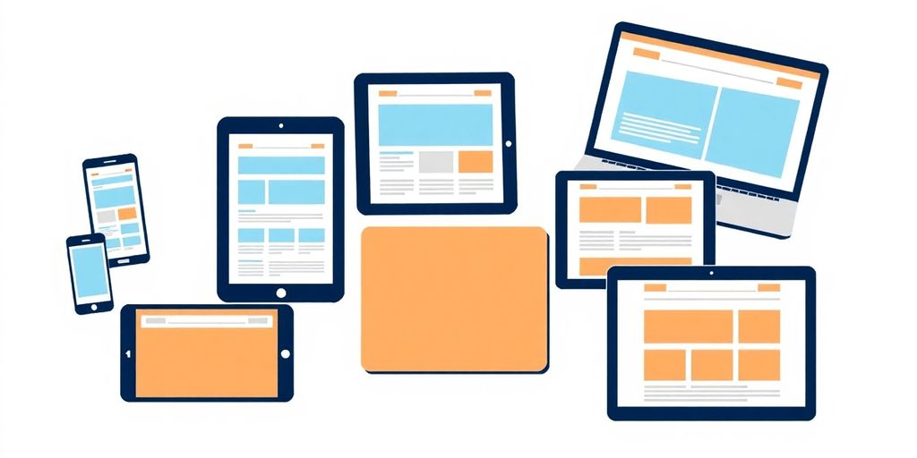
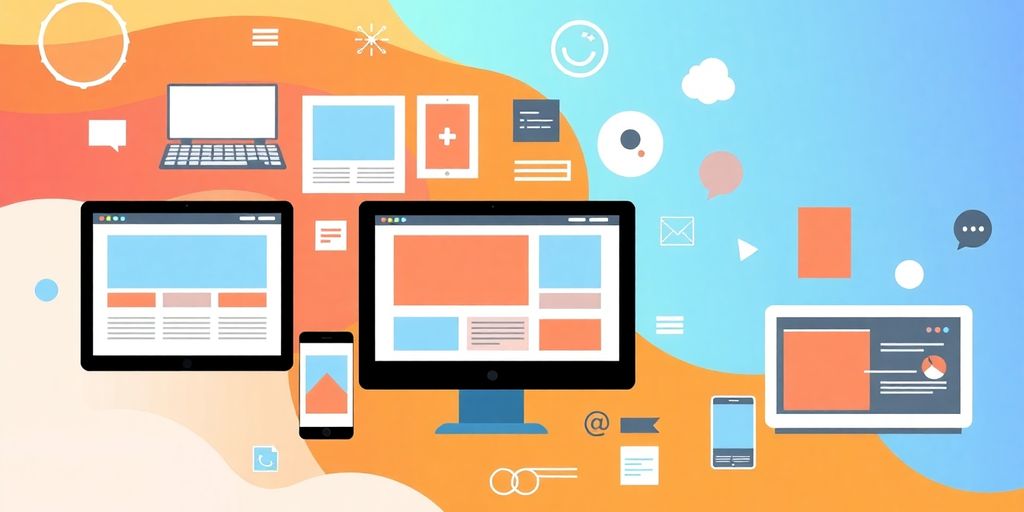
Responsive web design is a vital approach that ensures websites look and work well on all devices, from desktops to smartphones. This technique has become increasingly important as more people access the internet through mobile devices. By using various methods like flexible grids and media queries, designers can create sites that provide a seamless experience for users, no matter the screen size. Understanding these advanced techniques can help web designers build better, more accessible websites.
Key Takeaways
- Responsive web design adjusts layouts for different screen sizes, improving user experience.
- Using fluid grids allows content to resize proportionally, making it adaptable to various devices.
- Media queries enable designers to apply different styles based on device characteristics.
- A mobile-first approach prioritizes designing for smaller screens, enhancing usability on mobile devices.
- Testing responsive designs is crucial to ensure functionality and accessibility across all platforms.
Understanding the Basics of Responsive Web Design
What is Responsive Web Design?
Responsive Web Design, or responsive design, is all about making websites look good on any device, whether it’s a big desktop or a small smartphone. It adjusts the layout and content based on the screen size so that users have a great experience no matter how they access the site. This means we don’t need separate versions for mobile and desktop; instead, we create one flexible design that works everywhere.Key Principles of Responsive Design
There are three main ideas that guide responsive design:- Fluid Grids: Instead of using fixed sizes, we use percentages to make elements resize based on the screen size.
- Flexible Images: Images should also adjust to fit the screen, ensuring they don’t overflow or look too small.
- Media Queries: These are special rules that let us change styles based on the device’s characteristics, like its width or height.
Benefits of Responsive Web Design
Responsive design offers several advantages:- Improved User Experience: Users can easily navigate and read content on any device.
- Cost-Effective: We only need to maintain one website instead of separate sites for mobile and desktop.
- Better SEO: Search engines prefer responsive sites, which can help improve visibility.
In today’s digital world, having a responsive design is not just a nice-to-have; it’s a must for reaching all users effectively.By understanding these basics, we can start creating websites that are not only functional but also enjoyable for everyone!
Implementing Fluid Grids for Flexible Layouts

Introduction to Fluid Grids
Fluid grids are essential for creating layouts that can adjust to different screen sizes. They allow us to build websites that look great on any device, from smartphones to large desktop monitors. By using fluid grids, we can ensure that our designs are flexible and adaptable.Creating Responsive Grid Systems
To create a responsive grid system, we can follow these simple steps:- Use relative units like percentages instead of fixed units like pixels.
- Define the layout using a flexible grid formula: target width ÷ parent width = relative width.
- Ensure that all elements within the grid scale proportionally to maintain balance.
| Element | Width (%) | Margin (%) |
|---|---|---|
| Section | 63.2 | 1.9 |
| Aside | 29.4 | 1.9 |
Examples of Fluid Grid Usage
Fluid grids can be seen in action on many websites. For instance, when you resize your browser window, you’ll notice how the content adjusts smoothly. This is because the layout is built using flexible units that respond to the size of the viewport.Fluid grids not only enhance the visual appeal of a website but also improve its usability across different devices.By implementing fluid grids, we can create a more inclusive web experience, ensuring that users on various devices can access the same content without any hassle.
Optimizing Images for Responsive Design
Techniques for Responsive Images
When we think about making our websites look great on all devices, optimizing images is a big part of the puzzle. We want our images to look sharp and load quickly, no matter if someone is on a phone or a desktop. Here are some techniques we can use:- Use the CSS property
max-width: 100%;to ensure images resize properly. - Consider using Scalable Vector Graphics (SVGs) for logos and icons, as they can scale without losing quality.
- Implement responsive image techniques like the
<picture>element to serve different image sizes based on the device.
Using Scalable Vector Graphics (SVGs)
SVGs are fantastic for web design! They are lightweight and can be resized without any loss of quality. This means that whether someone is viewing your site on a small phone or a large monitor, the images will always look crisp. Plus, SVGs can be animated and styled with CSS, adding a fun touch to our designs.Ensuring Fast Load Times with Image Optimization
We all know that slow-loading images can drive visitors away. To keep our sites speedy, we should:- Compress images before uploading them to the web.
- Use the right file format (JPEG for photos, PNG for images with transparency, and SVG for graphics).
- Implement lazy loading to only load images when they are in the viewport.
By focusing on image optimization, we can create a smoother experience for our users, making our websites not only look good but also perform well.
Leveraging Media Queries for Device Adaptability
Understanding Media Queries
Media queries are a powerful tool in our web design toolkit. They allow us to apply different styles based on the device’s characteristics, like screen size and resolution. This means we can create layouts that look great on any device, from smartphones to large desktop monitors. By using media queries, we can ensure our websites are responsive and user-friendly.Applying Media Queries Effectively
To effectively use media queries, we can follow these steps:- Start with a mobile-first approach: Design for smaller screens first, then add styles for larger screens using media queries.
- Define breakpoints: Identify the screen sizes where your layout starts to break and apply media queries at those points.
- Combine styles: Instead of creating separate stylesheets for each device, include all media queries in one stylesheet for better performance.
/* Default styles for mobile */
body {
  font-size: 16px;
}

/* Styles for tablets and larger devices */
@media screen and (min-width: 600px) {
  body {
    font-size: 18px;
  }
}

@media screen and (min-width: 900px) {
  body {
    font-size: 20px;
  }
}
Common Mistakes to Avoid
When using media queries, we should be careful to avoid these common pitfalls:- Overusing breakpoints: Too many breakpoints can make our CSS messy and hard to manage.
- Ignoring performance: Loading unnecessary styles can slow down our site, especially on mobile devices.
- Neglecting testing: Always test our designs on multiple devices to ensure they look and function as intended.
By mastering media queries, we can create websites that not only look good but also provide a seamless experience for users, regardless of the device they are using. This adaptability is key to modern web design.
Conclusion
In conclusion, media queries are essential for creating responsive web designs. They help us adapt our layouts to different devices, ensuring a great user experience. By following best practices and avoiding common mistakes, we can leverage media queries to their full potential.Exploring Mobile-First Design Strategies
Why Mobile-First Matters
When we think about web design, it’s super important to start with mobile users in mind. Mobile-first design means we create our websites for smaller screens first, then adjust for larger ones. This approach helps us make sure that our sites are fast and easy to use on mobile devices, which is where most people browse the web today.Designing for Smaller Screens
Designing for smaller screens involves a few key steps:- Start with a clean layout: Keep it simple and focus on what’s most important.
- Use larger buttons: Make sure buttons are easy to tap, ideally at least 44px high.
- Place navigation wisely: Put important links at the bottom of the screen for easy access.
Adapting Content for Mobile Users
When we adapt content for mobile, we should consider:- Prioritizing essential information: Show users what they need first.
- Using progressive disclosure: Reveal more details as needed, keeping the interface clean.
- Testing on real devices: Always check how the site looks and works on actual phones.
By focusing on mobile-first design, we can create websites that not only look great but also perform well across all devices. This approach is essential for ensuring a smooth user experience.In summary, adopting a mobile-first strategy is crucial for modern web design. It helps us create responsive websites that cater to the needs of users, regardless of the device they are using. For more insights on responsive design, check out how responsive design enables website content to adjust seamlessly.
Enhancing User Experience with Progressive Enhancement
What is Progressive Enhancement?
Progressive enhancement is a web design approach that focuses on providing a basic experience for all users, regardless of their device or browser capabilities. This means that everyone can access the core content and functionality of a website. As users have better technology, they can enjoy enhanced features and experiences. This strategy is especially helpful for users with older devices or those who rely on assistive technologies.Benefits for Accessibility
By using progressive enhancement, we can create websites that are more accessible to everyone. Here are some key benefits:- Improved usability for users with older browsers.
- Better support for assistive technologies, ensuring that all users can navigate the site.
- Faster loading times for users with limited bandwidth, as they receive a simpler version of the site.
Implementing Progressive Enhancement
To effectively implement progressive enhancement, we can follow these steps:- Start with a solid foundation of HTML that provides essential content.
- Add CSS to enhance the visual presentation for users with modern browsers.
- Use JavaScript to introduce advanced features for those with capable devices.
By focusing on the core experience first, we ensure that all users can access our content, regardless of their technology.In conclusion, progressive enhancement is a powerful technique that helps us create more inclusive and user-friendly websites. It allows us to cater to a wide range of users, ensuring that everyone has a positive experience, no matter what device they are using. Let’s embrace this approach to enhance our web designs!
Utilizing Progressive Disclosure for Simplified Navigation
Understanding Progressive Disclosure
Progressive disclosure is a design technique that helps us show only the most important information first, while keeping additional details hidden until needed. This way, we can keep our navigation clean and user-friendly. By focusing on what users need at a glance, we can enhance their experience.Improving User Focus and Accessibility
When we use progressive disclosure, we can:- Reduce clutter in the navigation bar.
- Make it easier for users to find what they are looking for.
- Improve accessibility for all users, including those with disabilities.
Examples of Progressive Disclosure
Here are some effective ways to implement progressive disclosure in our designs:- Accordion Menus: These allow users to expand sections to see more options without overwhelming them at first glance.
- Curtain Pattern: This displays multiple levels of navigation at once, making it easier for users to find their way.
- Context-Specific Labels: Instead of generic labels like ‘Back’, we can use specific terms that guide users more clearly.
By using progressive disclosure, we can create a navigation experience that is not only simpler but also more enjoyable for users. This approach helps us ensure that our website remains intuitive and easy to navigate, regardless of the device being used.In conclusion, implementing progressive disclosure techniques can significantly enhance our website’s usability. It allows us to create a more organized and accessible navigation system that caters to the needs of all users.
Testing and Validating Responsive Web Designs
When it comes to ensuring our websites look great on all devices, testing and validation are key steps we can’t overlook. We want our users to have a seamless experience, no matter what device they’re using.Tools for Testing Responsiveness
Here are some handy tools we can use to test our responsive designs:- Responsinator: This free tool shows how our web pages look on different screen sizes by just entering the URL.
- Screenfly: Another free tool that lets us test our designs on various devices and screen sizes.
- LambdaTest’s LTBrowser: This tool offers features like network throttling and device rotation for thorough testing.
Best Practices for Testing
To make sure our designs are top-notch, we should follow these best practices:- Adopt a mobile-first approach: Start designing for smaller screens first, then scale up.
- Create fluid layouts: Use flexible grids and relative units to ensure content adapts smoothly.
- Set appropriate breakpoints: Define at least three breakpoints for different devices to enhance user experience.
Iterating Based on Feedback
After testing, it’s important to gather feedback and make necessary adjustments. Here’s how we can do that:- Conduct user testing: Get real users to interact with our site and provide feedback.
- Analyze performance metrics: Use tools to track how our site performs on different devices.
- Make iterative improvements: Regularly update our designs based on user feedback and performance data.
Testing our responsive designs is not just about fixing issues; it’s about creating a better experience for everyone. By focusing on user needs, we can ensure our websites are accessible and enjoyable.By following these steps and using the right tools, we can confidently validate our responsive web designs and provide a fantastic experience for all users.
Ensuring Accessibility in Responsive Web Design
Aligning with WCAG Guidelines
To make sure our websites are accessible, we need to follow the Web Content Accessibility Guidelines (WCAG). These guidelines help us create sites that everyone can use, including people with disabilities. Accessibility is not just a feature; it’s a necessity. Here are some key points to consider:- Ensure text can be resized up to 200% without breaking the layout.
- Use proper color contrast to make text readable.
- Provide alternative text for images so screen readers can describe them.
Common Accessibility Challenges
Even with responsive design, we can face challenges. Here are a few common ones:- Users may struggle with navigation if it’s not clear.
- Some content might be hidden on smaller screens, making it hard to find.
- Not all images have descriptions, which can confuse users relying on screen readers.
Creating Inclusive User Experiences
Creating an inclusive experience means thinking about all users. Here are some strategies:- Use fluid layouts that adapt to different screen sizes.
- Implement progressive enhancement to ensure basic content is accessible on all devices.
- Test your site with real users, including those with disabilities, to gather feedback.
By focusing on accessibility, we not only comply with standards but also create a better experience for everyone.In our journey to provide great web experiences, let’s not forget about the importance of accessibility. It’s essential for all users, including those who might be using Omaha web hosting services. Together, we can make the web a more inclusive place!
Comparing Responsive and Adaptive Web Design
When we dive into the world of web design, we often hear the terms responsive and adaptive thrown around. But what do they really mean? Let’s break it down together!Differences Between Responsive and Adaptive Design
Responsive web design is all about flexibility. It adjusts seamlessly to different screen sizes, whether you’re on a desktop or a smartphone. On the other hand, adaptive design creates fixed layouts for specific screen sizes. Here’s a quick comparison:| Feature | Responsive Design | Adaptive Design |
|---|---|---|
| Layout | Fluid and flexible | Fixed layouts for specific sizes |
| User Experience | Consistent across devices | Varies by device |
| Development Time | Generally quicker | Can be more time-consuming |
| Maintenance | Easier to maintain | Requires updates for each layout |
Advantages of Responsive Design
- Better User Experience: Users enjoy a consistent experience, no matter what device they use.
- SEO Benefits: Search engines prefer responsive sites, which can help with visibility.
- Cost-Effective: One design works for all devices, saving time and money.
When to Use Each Approach
- Responsive Design: Ideal for most websites, especially those with varied content.
- Adaptive Design: Useful for specific applications or when targeting particular devices.
In today’s digital world, understanding the differences between these two approaches helps us create better websites that cater to all users.By knowing the strengths and weaknesses of both responsive and adaptive design, we can make informed choices that enhance our web projects. Let’s keep exploring and improving our web design skills!
Future Trends in Responsive Web Design
As we look ahead, the world of responsive web design is evolving rapidly. Staying updated with these trends is essential for creating effective websites. Here are some key trends we should keep an eye on:Emerging Technologies in Web Design
- Artificial Intelligence (AI): AI is becoming a game-changer in web design, helping us create more personalized user experiences.
- Voice User Interface (VUI): With the rise of smart speakers, designing for voice interactions is becoming crucial.
- Augmented Reality (AR): AR can enhance user engagement by providing interactive experiences right on the web.
The Role of AI in Responsive Design
- AI tools can analyze user behavior and suggest design changes.
- Automated testing can ensure that our designs work well across all devices.
- Chatbots can improve user interaction, making websites more responsive to user needs.
Predictions for the Future of Web Design
- Increased Focus on Mobile-First Design: As mobile usage continues to rise, designing for mobile first will become the norm.
- Greater Emphasis on Accessibility: Ensuring our designs are accessible to everyone will be a priority.
- Integration of Advanced CSS Techniques: New CSS features will allow for more creative and flexible designs.
As we embrace these trends, we can create websites that not only look great but also provide a seamless experience for users, whether they are on a desktop or a mobile device. In places like Omaha and across Nebraska, web design will continue to adapt to meet the needs of all users.
Wrapping Up Responsive Web Design
In conclusion, responsive web design is all about making sure websites look great and work well on any device, whether it’s a big computer screen or a small phone. As more people use their phones to browse the internet, it’s super important for websites to be easy to use on all kinds of devices. By using techniques like flexible grids, fluid images, and media queries, designers can create sites that adjust to different screen sizes. This not only helps users have a better experience but also makes websites more accessible to everyone. So, as you dive into web design, remember that a responsive approach is key to reaching and satisfying all users, no matter how they access your site.Frequently Asked Questions
What is responsive web design?
Responsive web design is a way to make websites look good on any device, whether it’s a big computer screen or a small smartphone. It adjusts the layout and content automatically to fit the screen size.
Why is it important to use a mobile-first design approach?
A mobile-first design approach focuses on creating websites that work well on mobile devices first. This is important because many people use their phones to browse the internet.
How do flexible grids help in responsive design?
Flexible grids allow website elements to change size based on the screen width. This ensures that everything looks good and is easy to read on different devices.
What techniques can I use to make images responsive?
To make images responsive, you can set their width to 100% in CSS, use the max-width property, and ensure they resize properly on different screens.
Why is testing important for responsive web designs?
Testing is crucial because it helps ensure that your website works well on all devices. It allows you to find and fix any problems before users see them.
What are media queries, and how do they work?
Media queries are a CSS feature that lets you apply different styles based on the device’s characteristics, like its width or height. They help make your website look good on all screen sizes.
What is the difference between responsive and adaptive web design?
Responsive web design changes the layout dynamically based on the screen size, while adaptive web design creates fixed layouts for specific screen sizes.
How can I improve accessibility in responsive web design?
To improve accessibility, make sure your website meets accessibility guidelines, allows users to zoom in on content, and uses clear navigation to help all users find what they need.

