


Web Design, Hosting, and SEO Blog
Spring is a time for renewal and fresh starts, and what better way to refresh your Nebraska small business website than with a new color palette? Choosing the right colors can give your site a fresh look and feel, making it more appealing to visitors. With Nebraska’s unique landscape and vibrant culture, picking colors that resonate with local vibes can make a big difference. Let’s explore some of the best spring colors for Nebraska web design.
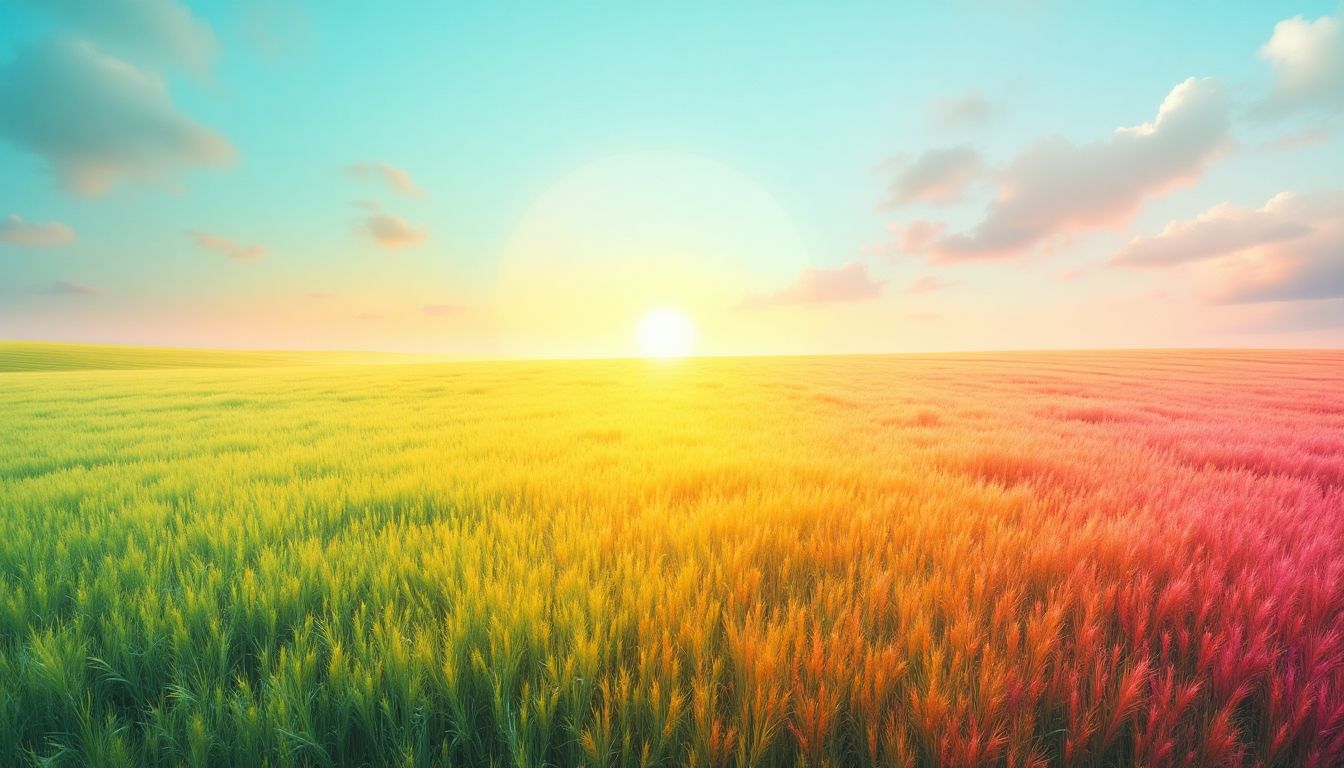
 You know that feeling when you step outside on a perfect spring day and the sky is just the right shade of blue? That’s exactly the vibe we’re going for with Sky Blue on your website. It’s all about creating a calm, inviting atmosphere that draws people in.Sky Blue is a fantastic choice for Nebraska businesses looking to convey trust and reliability. It’s like a breath of fresh air that can make your website feel open and spacious. Here are a few reasons why you might want to consider it:Alright folks, let’s talk about a color that just screams spring: Sunflower Yellow. It’s bright, it’s cheerful, and it’s perfect for catching the eye of anyone browsing your site. Imagine the sunny vibes this color brings, making it an ideal choice for Nebraska businesses looking to add a bit of warmth to their online presence.Wheat Gold is like the heart of Nebraska, a color that’s as warm and welcoming as a summer’s day. It’s not just a color; it’s a feeling, a vibe that resonates with those who call the Cornhusker State home. This shade is perfect for small businesses who want to capture that local charm and authenticity.Wheat Gold is a great choice for sites focusing on agriculture or any business wanting to convey a sense of reliability and warmth. This color brings a touch of nature into your digital space, making visitors feel grounded and at ease.Rustic red is like that old barn you see driving through Nebraska’s countryside. It’s warm, inviting, and has a timeless feel. This color is perfect for small businesses looking to create a cozy and welcoming atmosphere on their websites.
Key Takeaways
- Fresh Grass gives a lively and natural feel to your website, perfect for businesses wanting to connect with nature.
- Sky Blue brings a calm and peaceful vibe, ideal for creating a serene online presence.
- Sunflower Yellow adds a pop of brightness and cheer, making your site stand out and feel welcoming.
- Coral Reef is vibrant and energetic, great for businesses looking to make a bold statement.
- Lavender Fields offers a soothing and elegant touch, perfect for creating a relaxing atmosphere.
1. Fresh Grass
Ah, the color of fresh grass. Nothing quite screams spring like that vibrant green hue. It’s the perfect way to bring a touch of nature to your website, especially if you’re a small business in Nebraska. Green symbolizes growth and renewal, making it a great choice for businesses looking to convey a sense of freshness and vitality.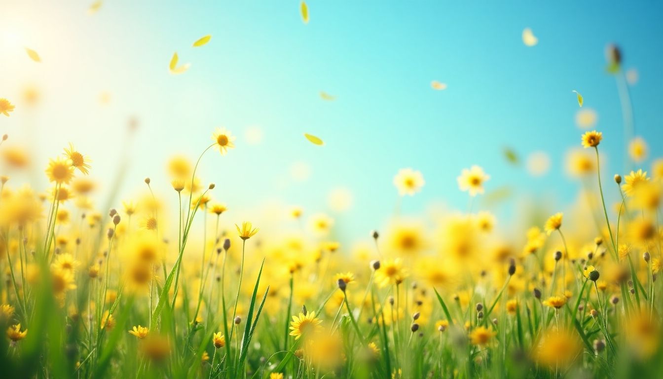
Why Choose Fresh Grass?
- Nature Connection: Green connects us to the outdoors, and who doesn’t love a bit of nature?
- Versatile: Works for a variety of industries, from landscaping to health and wellness.
- Calming Effect: It’s known to be easy on the eyes and can create a relaxing experience for your visitors.
Tips for Using Fresh Grass
- Balance with Neutrals: Pair it with whites or grays to keep the look clean and modern.
- Accent with Brights: Use pops of yellow or blue to add interest and energy.
- Consistent Branding: Make sure your other brand elements, like your logo, complement this vibrant hue.
Embracing the fresh grass color on your website can subtly convey your dedication to growth and a fresh perspective. It’s a natural fit for businesses aiming for a friendly and approachable image.Choosing a color like fresh grass can help your personal website stand out, providing a lively and welcoming feel that visitors will appreciate.
2. Sky Blue
 You know that feeling when you step outside on a perfect spring day and the sky is just the right shade of blue? That’s exactly the vibe we’re going for with Sky Blue on your website. It’s all about creating a calm, inviting atmosphere that draws people in.Sky Blue is a fantastic choice for Nebraska businesses looking to convey trust and reliability. It’s like a breath of fresh air that can make your website feel open and spacious. Here are a few reasons why you might want to consider it:
- Trustworthy and Calm: Blue is often associated with trust and dependability, which are key for any business looking to build lasting relationships with customers.
- Versatile: Whether you’re a local bakery or a tech startup, Sky Blue can adapt to fit your brand’s personality. It pairs well with both warm and cool tones, making it easy to incorporate into your existing color palette.
- Refreshing: Just like a clear sky, this color can make your website feel fresh and modern, which is perfect for capturing the essence of spring.
A splash of Sky Blue on your website could be just the thing to make your visitors feel welcome and at ease. It’s a simple yet effective way to enhance your online presence and connect with your audience.When it comes to web hosting, choosing a local provider can make all the difference. Local hosting ensures faster support and a better understanding of market needs, which is crucial for maintaining a secure and efficient website. Speaking of security, it’s important to understand the importance of professional web security services to protect your business from potential threats. With Sky Blue, you’re not only choosing a great color but also setting the stage for a secure and reliable online experience.
3. Sunflower Yellow
 Alright folks, let’s talk about a color that just screams spring: Sunflower Yellow. It’s bright, it’s cheerful, and it’s perfect for catching the eye of anyone browsing your site. Imagine the sunny vibes this color brings, making it an ideal choice for Nebraska businesses looking to add a bit of warmth to their online presence.
Sunflower Yellow is like a burst of sunshine on your website, bringing positivity and energy to your brand.Why choose Sunflower Yellow for your website?
- Boosts Mood: This color is known for its ability to lift spirits. When visitors land on your page, they’ll feel that instant happiness, which might just keep them around a little longer.
- Attracts Attention: It’s hard to miss a bright yellow. This makes it great for call-to-action buttons or important notices you want to highlight.
- Versatile Pairing: Sunflower Yellow pairs well with various colors like navy blue, soft grays, and even earthy browns, giving you flexibility in your design.
4. Coral Reef
Hey folks, let’s dive into the vibrant world of Coral Reef! This color is like a breath of fresh air, bringing a splash of energy and warmth to any website. Perfect for small businesses in Nebraska looking to stand out in the spring.Why Choose Coral Reef?
- Vibrant and Energetic: Coral Reef is a lively hue that can capture attention and evoke a sense of enthusiasm. It’s perfect for businesses wanting to convey a youthful and dynamic brand.
- Versatile Pairing: This shade pairs well with other colors, like navy or white, allowing for creative and appealing designs.
- Seasonal Appeal: Coral Reef resonates with the blooming flowers and sunny days of spring, making it an ideal choice for seasonal promotions.
“Color can speak to the heart, and Coral Reef does just that. It whispers of warmth and joy, making it a delightful choice for any business looking to refresh their image.”Consider using Coral Reef for your website’s call-to-action buttons or as an accent color in your logo. It’s a great way to add a touch of modern flair without overwhelming the overall design.And remember, when it comes to Local SEO, the right color can make your website more engaging, keeping visitors around longer. So, why not give Coral Reef a try and see the difference it makes?
5. Lavender Fields
Picture this: a gentle breeze, fields of lavender swaying softly under the Nebraska sun. That’s the vibe we’re aiming for when we talk about incorporating “Lavender Fields” into your website’s color scheme. This shade isn’t just any purple; it’s a soft, calming hue that brings a sense of peace and tranquility to your digital space.Lavender is perfect for businesses looking to create a serene and welcoming online atmosphere. It’s especially great for those in wellness, health, or even boutique retail sectors. The soothing effect of lavender can make your site visitors feel relaxed and more inclined to explore what you have to offer.- Why Lavender Works
- Calming Influence: Lavender is known for its calming properties, making your website feel like a digital spa.
- Versatility: Pairs well with various other colors, offering flexibility in design.
- Modern Appeal: Keeps your site looking fresh and up-to-date.
Embracing lavender in your web design can subtly enhance your brand’s welcoming nature, making visitors feel at ease and more connected to your message.When you’re thinking about effective web design, remember that simplicity and consistency are key. Lavender fits right into this strategy by providing a consistent, soothing backdrop that doesn’t overwhelm your visitors. And if you’re concerned about budget, affordable web design solutions are available to help you achieve this look without breaking the bank.So, if you’re ready to transform your site into a calming oasis, consider adding a touch of lavender. It’s a color choice that whispers “welcome” and invites visitors to stay a while.
6. Earthy Brown
Alright, folks, let’s talk about Earthy Brown. This color is like a warm hug from Mother Nature herself. It’s cozy, grounded, and perfect for creating a welcoming vibe on your website. Think about those rich, chocolatey shades that make you feel right at home.Earthy Brown isn’t just a color; it’s a mood. It whispers comfort and stability, making it an ideal choice for businesses that want to convey trust and reliability.Here’s why Earthy Brown can be a game-changer for your website:
- Warmth and Comfort: Earthy Brown brings a sense of warmth and comfort. It’s inviting, making visitors feel like they’re in a cozy space.
- Natural Connection: This color connects us to nature, reminding us of the earth, trees, and all things natural. It’s perfect for businesses that want to emphasize sustainability or a natural approach.
- Timeless Appeal: Earthy Brown never goes out of style. It’s a classic choice that can give your website a timeless look.

7. Cherry Blossom Pink
Cherry Blossom Pink is a color that screams spring. It’s like that first warm breeze after a long winter. We love how it brings a soft, romantic vibe to any website, making it perfect for small businesses in Nebraska looking to add a touch of elegance and charm.Cherry Blossom Pink is not just a color; it’s an experience. It invites visitors to feel the gentle warmth of spring, creating a welcoming atmosphere.
Why Cherry Blossom Pink?
- Warm and Inviting: This shade is inviting, making it ideal for businesses that want to create a friendly and approachable online presence.
- Versatile: It pairs well with other pastel shades and neutral tones, allowing for a cohesive and harmonious design.
- Emotional Appeal: Pink is known for its calming and nurturing qualities, which can enhance user experience.
How to Use Cherry Blossom Pink
- Backgrounds: Use it as a background color to create a soft, welcoming environment.
- Accents: Incorporate it in buttons or call-to-action elements to draw attention without being overwhelming.
- Typography: Pair it with clean, simple fonts to maintain readability while adding a touch of color.
8. Ocean Teal
Ocean Teal is a color that brings to mind the vastness of the sea and the tranquility it offers. It’s a perfect choice for Nebraska small businesses looking to create a calming and inviting online presence. This shade is versatile and can be paired with a variety of other colors to create a balanced and harmonious look.- Calming Effect: Ocean Teal has a soothing quality that can help reduce stress and create a sense of peace. This is particularly beneficial for businesses in industries like wellness, hospitality, or any service-oriented field where creating a relaxing environment is key.
- Versatility: This color pairs well with both warm and cool tones, making it a flexible choice for a wide range of design schemes. You can combine it with sandy beige for a beachy vibe or with crisp white for a more modern look.
- Symbolism: Ocean Teal is often associated with emotional balance and clarity. Using this color can subtly convey a message of trust and stability to your customers, which is crucial for building long-term relationships.

Ocean Teal might just be the perfect hue to refresh your website this spring. It’s like bringing a bit of the ocean to the heart of Nebraska, offering a unique twist that can make your business stand out.If you’re considering updating your website’s color scheme, think about the benefits of opting for Nebraska-based web hosting solutions. The local touch can enhance your brand’s authenticity and connect you more closely with your community. And don’t forget, getting your business listed on Google Maps can significantly boost your visibility in Omaha. Check out our affordable web design, hosting, and SEO services to support your online presence.
9. Wheat Gold
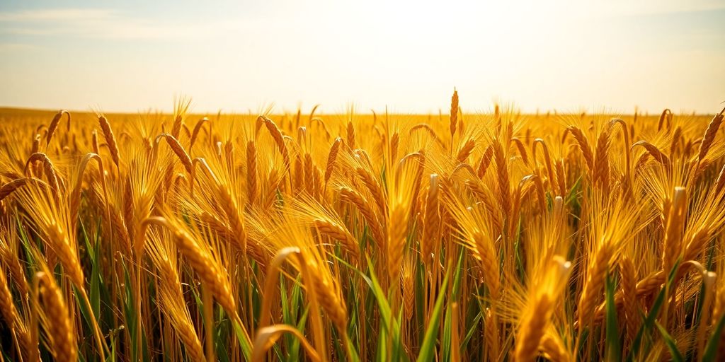 Wheat Gold is like the heart of Nebraska, a color that’s as warm and welcoming as a summer’s day. It’s not just a color; it’s a feeling, a vibe that resonates with those who call the Cornhusker State home. This shade is perfect for small businesses who want to capture that local charm and authenticity.Wheat Gold is a great choice for sites focusing on agriculture or any business wanting to convey a sense of reliability and warmth. This color brings a touch of nature into your digital space, making visitors feel grounded and at ease.
Why Choose Wheat Gold?
- Warmth and Comfort: It evokes the feeling of harvest time and the abundance of nature.
- Versatile Pairing: Works well with other colors like greens and blues.
- Local Appeal: Reflects the natural beauty of Nebraska fields.
Wheat Gold is more than just a color; it’s a nod to the heartland’s spirit and a way to connect with the local community.
How to Use Wheat Gold Effectively
- Highlight Key Areas: Use Wheat Gold for buttons or call-to-action sections to draw attention.
- Backgrounds: A soft Wheat Gold background can create a welcoming atmosphere.
- Text and Accents: Pair it with darker fonts for readability while maintaining that friendly feel.
10. Rustic Red
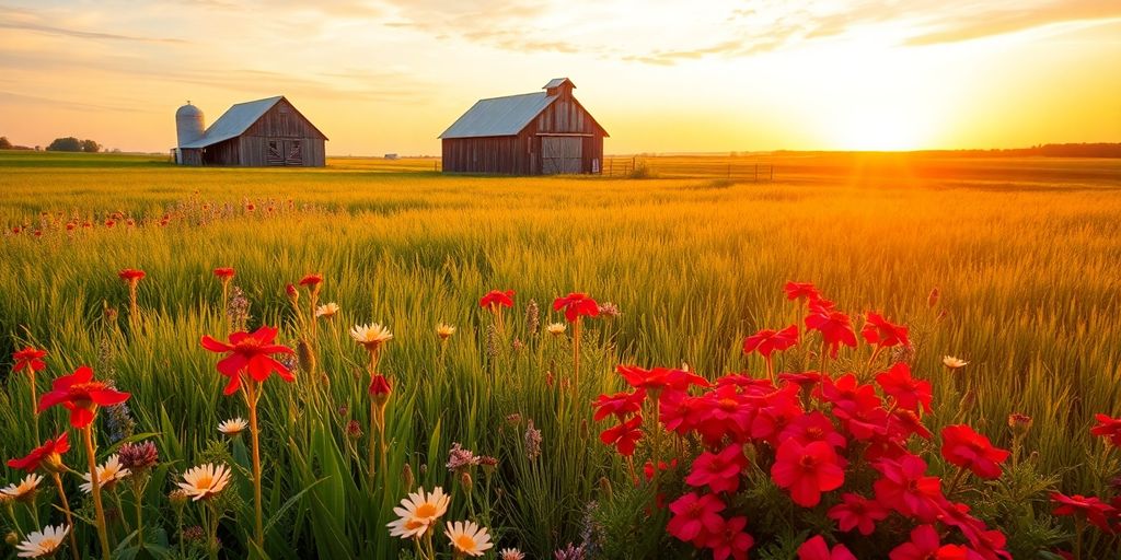 Rustic red is like that old barn you see driving through Nebraska’s countryside. It’s warm, inviting, and has a timeless feel. This color is perfect for small businesses looking to create a cozy and welcoming atmosphere on their websites.
Imagine a color that brings to mind the warmth of a sunset over the plains. That’s rustic red for you. It’s a shade that feels both comforting and energetic, perfect for engaging your visitors.Here’s why rustic red is a fantastic choice:
- Warmth and Comfort: This color radiates warmth, making visitors feel at home. It’s like welcoming them with a friendly smile.
- Versatility: Rustic red pairs beautifully with neutral tones like beige and grey, adding depth without overpowering.
- Eye-Catching: It’s bold enough to grab attention but subtle enough to maintain a professional look.