
Senior and home care website design
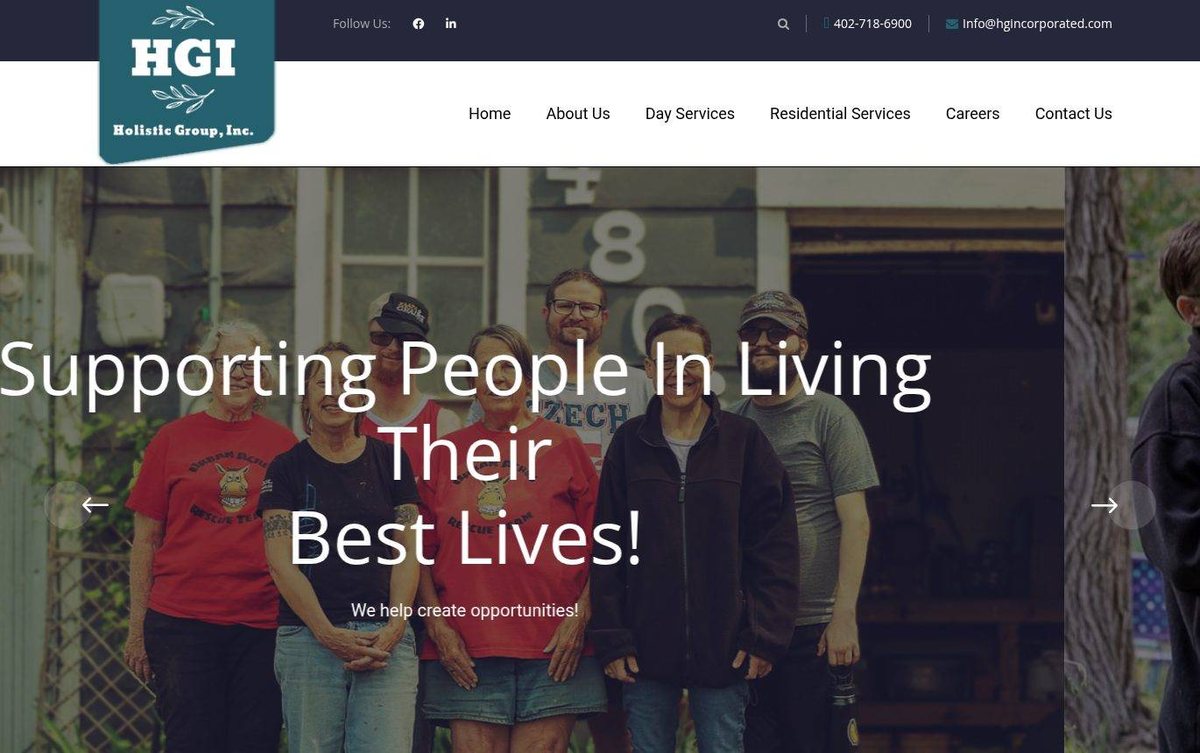
Warm people photo and bold headline welcome visitors
The site introduces an organization that supports people in living their best lives. A large headline and a people-focused photo make the mission easy to understand.
- Large headline states the mission in clear words
- Real photo of the team builds trust
- Contact details and menu easy to find
For Holistic Group, we put friendly faces at the front of the page, and cheap web design fits a small budget.
Layout and navigation
A dark top bar holds contact details and social icons above the logo and main menu. A full-width hero slider with a large headline and arrow controls fills the first screen.
Color palette
Deep teal and dark navy give the brand a steady, dependable character. Off-white menu space keeps navigation calm and easy to read.
- deep teal #2B5F6B
logo badge - dark navy #1F1D2B
top contact bar - off-white #F8F8F8
main menu background - warm taupe #5E5648
hero photo overlay
Typography
Headlines use Open Sans in a large size for the hero message. Menu text uses Roboto, a clean sans serif that reads well on screens.
A web designer in Nebraska can help a senior care company sound caring and clear in the first headline.
Images and graphics
A group photo of staff and the people they serve shows the real community behind the work. Social and contact icons appear in the top bar.
How it is built
The page uses HTTPS and includes a mobile-ready viewport tag. Clear menu labels and contact details in the top bar help visitors find information.