

Retail and shopping website design
Soft aqua palette and a clear product showcase
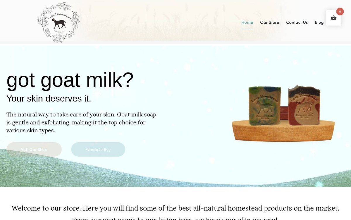
The store presents goat milk soaps in a soft, natural style. A large hero banner and a row of newest products let shoppers browse quickly.
- Large product photos show each soap clearly
- Soft palette matches the natural skincare theme
- Clear buttons lead visitors to the shop
Layout and navigation
A header holds the logo, a short menu and a cart icon above a wide hero banner. The hero shows a large headline and two buttons, followed by a welcome line and a carousel of newest products.
A Nebraska web designer should show handmade soap in a way that feels gentle, and this soft aqua palette does just that.
Color palette
Pale aqua and soft teal create a fresh, calm mood that fits a natural skincare brand. Taupe and charcoal add warmth and keep the text easy to read.
- pale aqua #F1FFFF
hero background - soft teal #76B1BD
Where to Buy button and active menu link - dusty taupe #C9AC9A
Visit Our Shop button and product buttons - charcoal #2B2B2B
headlines and menu text
The goat-milk soap hero tells visitors what the shop sells in one glance, which is what a web designer in Omaha aims for.
Typography
Headlines use a large sans serif in charcoal for a clear, modern voice. Body text uses Lora, a serif face that feels warm and relaxed.
Images and graphics
Product photos of soaps on wooden stands show each bar clearly. A goat illustration in the logo adds a homestead theme.
How it is built
The page uses HTTPS and includes a mobile-ready viewport tag. The layout keeps product photos and text in clear, separate blocks for easy scanning.