

Nonprofits and community website design
Clear orange accents guide visitors to free screening
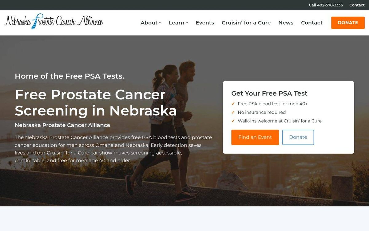
The design puts a free screening offer first on every visit. It suits a health nonprofit that wants men to act quickly.
- Free screening offer shown above the fold
- Clear orange calls to action throughout
- Easy navigation with a donate button
Layout and navigation
A full-width hero photo leads with a bold headline and a white offer card. Three clear service cards follow, each with a link to learn more.
Color palette
Orange buttons stand out against the slate header and pale blue-gray sections. The mix feels energetic and trustworthy for a health cause.
- slate gray #2E3A3F
top contact bar and impact section - bright orange #FF6A13
donate and event buttons - pale blue-gray #F4F7FA
section background - sky blue #1E88C7
logo accent and outline button
Orange accents on a white page show that affordable web design can guide visitors with a clear next step.
Typography
The text uses a clean geometric sans-serif in a few clear weights. Headlines are large and bold, and body copy stays easy to read.
Images and graphics
Real photos of runners, a volunteer tent, and families show the mission. Each service card has its own photo that matches its topic.
How it is built
The site loads over secure HTTPS. Its large photo and bold headline give visitors a clear, readable first screen.