Senior and home care website design
Soft blue hero with warm, welcoming photography
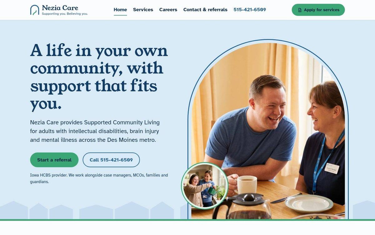
The care provider's home page welcomes visitors with a warm hero photo and a clear message. Two buttons let families start a referral or call right away.
- Warm photos show people in daily life
- Two clear buttons for referrals and calls
- Legible body text supports easy reading
Nezia Care shows how we offer cheap web design with a soft, calm and welcoming feel for families.
Layout and navigation
A white header holds the logo, main menu and a green apply button. The pale blue hero places a large headline and referral buttons beside an arched photo, followed by a clear section below.
Color palette
Sky blue and green feel calm, caring and hopeful. Deep navy keeps the headlines strong and easy to read.
- pale sky blue #D9EBF7
hero background - deep navy #17406B
headline and menu text - green #3AA676
referral and apply buttons - mint #DFF3E8
lower section background
Typography
The site uses Young Serif for headlines and Atkinson Hyperlegible for body text. The legible body face suits readers who need clear text.
A web designer in Nebraska can serve a care business in Des Moines just as well as one at home.
Images and graphics
Warm photos show residents and staff sharing everyday moments. A small inset photo adds a second view of daily life.
How it is built
The site uses secure HTTPS and a mobile-ready viewport setting. It has one main heading, descriptive alt text on its images and structured data.