

Media and entertainment website design
Tidy three-column layout with bold, friendly brand colors
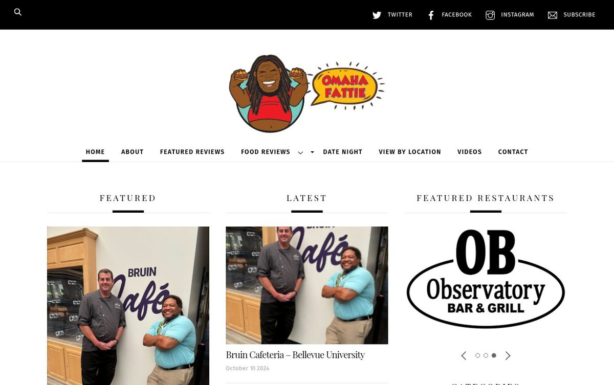
The site helps local diners find restaurant reviews by category and area. Organized columns and clear category lists make browsing easy.
- Easy category browsing for local restaurant fans
- Warm red and yellow logo colors
- Clear three-column layout with featured content
Layout and navigation
A black top bar and a centered logo lead into a main navigation row. Three columns show featured reviews, latest posts and restaurant highlights, with a weekly updates panel nearby.
Color palette
Black and white keep the reading area clean and sharp. Red and yellow from the logo add warmth and a lively, food-friendly feel.
- white #FFFFFF
page background - black #060606
top bar, navigation and headings - red #D92B2B
logo accent - yellow #FFD21F
logo speech bubble
We offer cheap web design, and these warm red and yellow colors give this site energy.
Typography
Headings use Playfair Display in spaced capitals. Body and menu text use Fira Sans, which keeps reading comfortable.
Images and graphics
Large restaurant photos and a cartoon mascot logo add personality. Photo thumbnails in the review grid show the dining experience clearly.
How it is built
The page is mobile-ready with secure HTTPS and a clear viewport setting. Structured data, Open Graph tags and one main heading support search results.