

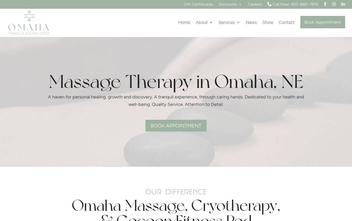
Health and wellness website design
Calm sage palette with a relaxing, welcoming feel
The site presents massage, cryotherapy and fitness services with a calm, spa-like look. Clear booking buttons guide visitors toward an appointment.
- Calm sage palette with soft, welcoming photography
- Clear booking buttons guide visitors to appointments
- Service sections explain each treatment with helpful detail
Soft sage tones show that affordable web design can create a quiet, welcoming space for visitors.
Layout and navigation
A full-width hero photo leads with a bold headline and a Book Appointment button. Service panels alternate with photos, so each offer gets its own space.
Color palette
Sage green buttons stand out against white sections and soft taupe photo overlays. The colors feel gentle and suggest wellness, rest and care.
- sage green #9CB3A0
booking buttons and top bar - soft taupe #E3DDDB
hero photo overlay and tinted sections - soft black #2B2B2B
headings and body text - white #FFFFFF
content background and service panels
Local studios can call a web designer in Omaha and talk through colors, photos and wording.
Typography
Headings use Recorda Normal, a light display face, and body text uses Figtree Light for easy reading. Generous line spacing keeps paragraphs open and readable.
Images and graphics
Soft spa photos of stones, orchids and massage settings set a relaxing mood. Service images show the treatments in a natural way.
How it is built
The site uses HTTPS and a mobile-ready viewport setting. Structured data and social sharing tags support search and link previews.