
Storage and rentals website design
Bold color and logo make a memorable first impression
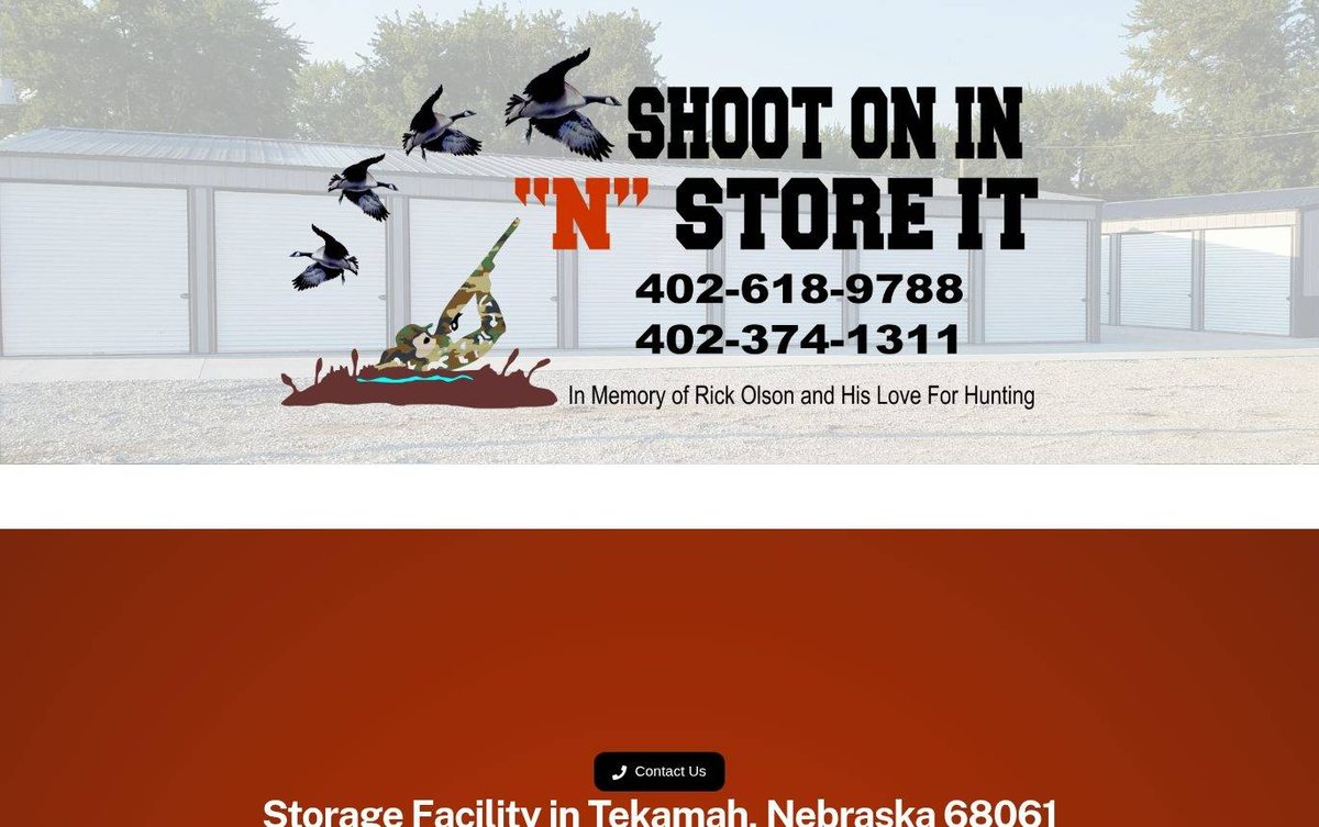
The home page opens with a large logo over a storage lot photo. Unit cards below present the size options in an easy-to-scan layout.
- Strong logo creates an instant local identity
- Unit cards compare sizes at a glance
- Call button stays visible for quick contact
Layout and navigation
A full-width banner leads into a deep orange section with the facility name. Three unit cards line up in a row, each with a size label above a photo and its details.
Color palette
Burnt orange and black feel bold and rugged. Light gray tones keep the banner calm and let the logo stand out.
- burnt orange red #962B08
main background - black #000000
unit size labels and logo lettering - light gray #E1E4E5
banner backdrop - white #FFFFFF
section divider
A Nebraska web designer can use one bold color to make a storage business easy to remember, like this burnt orange.
Typography
Public Sans sets the headings in heavy bold type. Arial and Helvetica serve as backup fonts for body text and labels.
Images and graphics
A painted hunting logo with flying geese sits over a storage lot photo. Unit photos show each size with dimension callouts.
How it is built
The pages use secure HTTPS and a mobile-ready viewport. Structured data and Open Graph tags support search and social sharing.