
Real estate website design
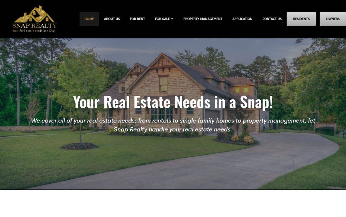
Bold white headline over a warm property photograph
The design leads with a large property photo and a bold headline about real estate services. It suits a property firm that wants renters and owners to find the right page fast.
- Large property photo fills the hero section
- Clear menu for rentals and sales
- Dedicated buttons for residents and owners
A bold white headline over a home photo shows how affordable web design can sell a feeling of place.
Layout and navigation
A black header holds the logo, the main menu, and two buttons for residents and owners. A full-width hero sits below with a centered headline and supporting line.
Color palette
Black and gold give the brand a polished, premium look. Green tones in the photo tie the page to the outdoors and the homes shown.
- black #000000
header background - gold #C49A3A
logo accent and active menu item - forest green #394A38
photo tones - silver gray #B3B3B3
residents and owners buttons
Agents across the river can hire a web designer in Omaha who understands local buyers.
Typography
The headline uses Dosis, a rounded sans-serif. Body text falls back to Arial, which keeps the supporting lines easy to read.
Images and graphics
A large photo of a stone home with a driveway fills the hero. The logo shows a house with a gold sparkle motif.
How it is built
The site loads over secure HTTPS with a mobile viewport setting. Its markup includes Open Graph tags for sharing.