

Insurance agents website design
Bold service grid and a clear contact call-to-action
The page introduces an insurance agency with a strong first impression. Visitors can scan product areas and reach out quickly.
- Clear product tiles with recognizable photos
- Bold red contact button in the hero
- Secure HTTPS and mobile-ready layout
Layout and navigation
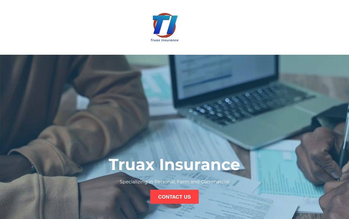
A full-width photo hero carries the agency name and a red contact button. Below, a grid of eight product tiles helps visitors find their coverage fast.
Color palette
Blue tones suggest calm, trust and careful planning. Red adds energy and draws the eye to the services and contact button.
- dark slate blue #253746
hero overlay tint - dark red #8B0000
services heading band - brick red #A93D2B
services grid background - bright red #FF4444
Contact Us button
A Nebraska web designer can make insurance feel simple, and this bold services grid with clear labels shows how.
Typography
Montserrat appears in the headline and hero text, with Roboto in the services heading. Clean sans serif type keeps the page modern.
Images and graphics
Photos of people, homes, vehicles and boats show each service. The hero image shows a professional reviewing paperwork.
How it is built
Pages load over HTTPS and include a viewport setting for phones. Structured data and open graph tags help search and social sharing.