

Nonprofits and community website design
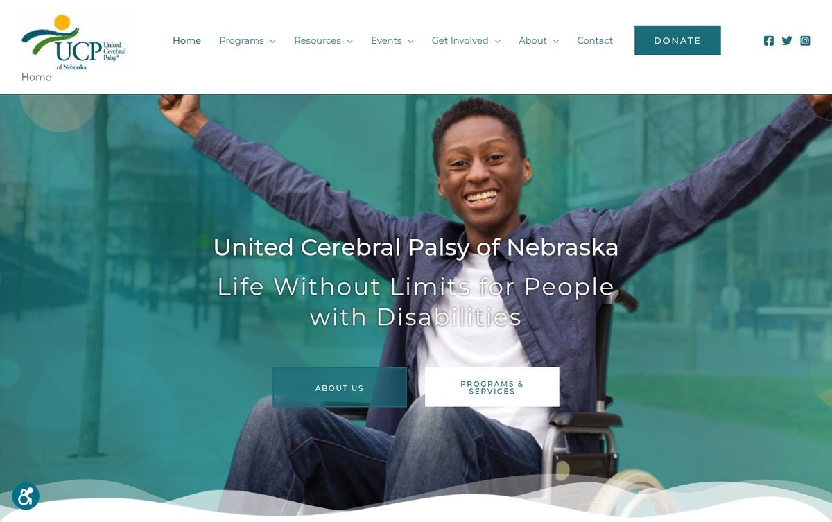
Hopeful teal imagery with a clear, welcoming headline
The site welcomes families and supporters with a hopeful message about inclusion. Two clear buttons lead visitors to learn about the organization and its programs.
- Hopeful photo hero sets an inspiring first impression
- Clear buttons lead to programs and about pages
- Teal palette ties the header, photo and buttons together
Teal imagery on this page shows that affordable web design can feel hopeful and welcoming.
Layout and navigation
A full-width hero photo fills the first screen, with the headline centered over it. Two buttons, About Us and Programs & Services, sit side by side below the title.
Color palette
Teal tones in the photo and buttons create a calm, unified look. White text and a deep teal donate button give clear contrast and a sense of trust.
- deep teal #2B7776
donate button and programs button - teal #3A8B87
hero photo overlay - white #FFFFFF
header and wave edge - dark slate #2E2D39
body text and menu labels
Nonprofits can reach a web designer in Omaha who explains each step in plain words.
Typography
The page lists Roboto, Montserrat and Helvetica as its main type choices. Spaced capital letters on buttons keep labels easy to read.
Images and graphics
A close photo of a raised fist and a blurred city street expresses strength and advocacy. Soft circles and wave shapes add visual movement.
How it is built
The page uses HTTPS and a mobile-ready viewport setting. Its navigation menu and title tag help visitors and search engines find each section.