Key Takeaways
- Responsive web design adjusts layouts to different screen sizes.
- Fluid grids let content resize in proportion, so it fits any device.
- Media queries apply different styles based on the device.
- A mobile-first approach starts with small screens.
- Test your layouts on real devices to check that they work for everyone.
The Basics of Responsive Web Design
What is Responsive Web Design?
Responsive design, or responsive web design, makes websites look good on any device, big or small. It adjusts the layout and content to the screen size. We do not need separate versions for mobile and desktop. We build one flexible design that works everywhere.Key Principles of Responsive Layouts
Three main ideas guide responsive web design:- Fluid grids: Instead of fixed sizes, we use percentages so elements resize with the screen.
- Flexible images: Images adjust to fit the screen. They do not overflow or look too small.
- Media queries: These rules change styles based on the device, such as its width or height.
Why Use Responsive Web Design?
Responsive layouts offer several advantages:- Better experience: People can read and move around on any device.
- Lower cost: One responsive design means you maintain one website instead of separate sites for mobile and desktop.
- Better SEO: Google recommends responsive layouts for mobile-friendly sites.
Fluid Grids for Flexible Layouts

What Are Fluid Grids?
Fluid grids let a layout adjust to any screen size, from a phone to a large monitor. With fluid grids, our designs stay flexible.How to Build a Responsive Grid
To build a responsive grid, follow these steps:- Use relative units like percentages instead of fixed units like pixels.
- Use this formula: target width ÷ parent width = relative width.
- Make sure every element in the grid scales in proportion.
| Element | Width (%) | Margin (%) |
|---|---|---|
| Section | 63.2 | 1.9 |
| Aside | 29.4 | 1.9 |
Fluid Grids in Use
Responsive design relies on fluid grids, and you can see them on many websites. Resize your browser window and watch the content adjust smoothly. The layout uses flexible units that respond to the width of the window.Fluid grids improve how a site looks and how easily people use it on any device.
Optimizing Images for Any Screen
Tips for Responsive Images
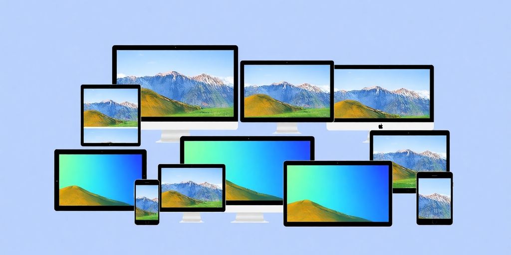
Optimizing images is a big part of the work. We want images that look sharp and load fast on a phone or a desktop. These techniques help:- Use the CSS property
max-width: 100%;so images resize properly. - Use Scalable Vector Graphics (SVGs) for logos and icons. They scale without losing quality.
- Use the
<picture>element to serve different image sizes to different devices. It is a key tool of responsive design.
Using Scalable Vector Graphics (SVGs)
SVGs are light and can be resized with no loss of quality. Whether your reader is on a small phone or a large monitor, the image stays crisp. You can also animate and style SVGs with CSS. They suit modern web design well.Make Pictures Load Fast
Slow images drive people away. To keep your site fast:- Compress images before you upload them.
- Use the right file format: JPEG for photos, PNG for images with transparency and SVG for graphics.
- Use lazy loading so images load only when they come into view.
Media Queries Fit Layouts to Any Device
What Are Media Queries?
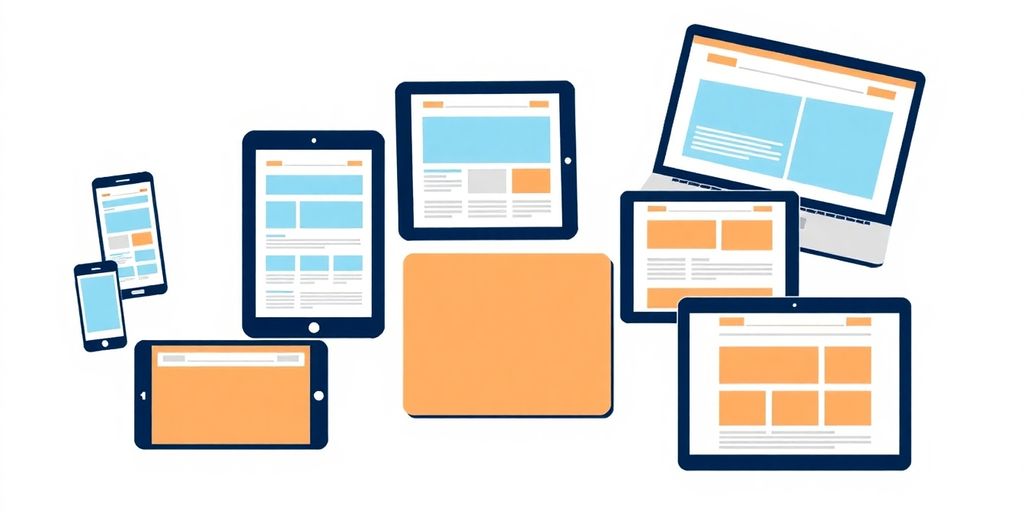
Media queries are a core tool of responsive design. They let us apply different styles based on a device’s screen size and resolution. With them, one layout can look right on a phone and on a large monitor.How to Use Media Queries
Follow these steps to use media queries well:- Start mobile-first: Design for small screens first. Then add styles for larger screens with media queries.
- Define breakpoints: Find the screen widths where your layout starts to break. Add a media query at each one.
- Combine styles: Keep all media queries in one stylesheet instead of one stylesheet per device. This helps performance.
/* Default styles for mobile */
body {
  font-size: 16px;
}

/* Styles for tablets and larger devices */
@media screen and (min-width: 600px) {
  body {
    font-size: 18px;
  }
}

@media screen and (min-width: 900px) {
  body {
    font-size: 20px;
  }
}
Common Mistakes to Avoid
Avoid these common mistakes with media queries:- Too many breakpoints: They make CSS messy and hard to manage.
- Ignoring performance: Extra styles slow down a site, especially on phones.
- Skipping tests: Test your design on several devices.
Master media queries and your site works on any device. They are a core skill in modern web design.
Conclusion
Mobile-First Design
Why Mobile-First Matters
When we plan Omaha web design projects, we start with mobile users in mind. Mobile-first design means we build for small screens first, then adjust for larger ones. This keeps sites fast and easy to use on a phone, which is where most people browse today.Designing for Smaller Screens
Designing for small screens takes a few key steps:- Start with a clean layout: Keep it simple and focus on what matters most.
- Use larger buttons: Make buttons easy to tap, at least 44px high.
- Place navigation wisely: Put key links at the bottom of the screen, where a thumb can reach them.
Fit Your Content to Phones
Adapt your content for mobile with these ideas:- Show essentials first: Give people what they need first.
- Use progressive disclosure: Reveal more details only when needed.
- Test on real devices: Check how the site looks and works on actual phones.
Progressive Enhancement: Start Simple
What is Progressive Enhancement?
Progressive enhancement is a web design approach that gives every reader a basic experience, whatever their device or browser. Everyone can reach the core content and functions. People with better technology get extra features. This helps people with older devices or assistive technologies.Benefits for Everyone
Progressive enhancement makes your site easier to use for everyone. Key benefits:- Better usability for older browsers.
- Better support for assistive technologies, so everyone can move around the site.
- Faster loading for people with limited bandwidth, because they get a simpler version.
How to Use Progressive Enhancement
To use progressive enhancement in your website design, follow these steps:- Start with solid HTML that holds the essential content.
- Add CSS to improve the look for modern browsers.
- Add JavaScript for advanced features on capable devices.
Starting with the core experience means everyone can reach your content.
Progressive Disclosure Keeps Menus Simple
What Is Progressive Disclosure?
Progressive disclosure shows the most important information first and hides extra details until needed. This keeps navigation clean. Focus on what people need at a glance.Keep People Focused
Progressive disclosure helps you:- Reduce clutter in the navigation bar.
- Make it easier for people to find what they want.
- Improve access for everyone, including people with disabilities.
Ways to Use It
Here are some ways to use progressive disclosure in responsive design:- Accordion menus: People expand a section to see more options, so the menu does not overwhelm them at first glance.
- Curtain pattern: This shows several levels of navigation at once, which helps people find their way.
- Context-specific labels: Use specific words instead of a generic label like “Back.”
Test Your Responsive Layouts
Test and validate your layouts before launch. People should get a smooth experience on every device.Tools for Testing
These tools help you test a responsive layout:- Responsinator: This free tool shows how your page looks at different screen sizes. Enter the URL.
- Screenfly: Another free tool to test your design on various devices and screen sizes.
- LambdaTest’s LTBrowser: This tool offers network throttling and device rotation for thorough testing.
Testing Tips
Follow these best practices when you test responsive design:- Go mobile-first: Design for small screens first, then scale up.
- Use fluid layouts: Use flexible grids and relative units so content adapts smoothly.
- Set breakpoints: Define at least three breakpoints for different devices.
Improve From Feedback
After testing, gather feedback and adjust:- Run user tests: Ask real people to use your site and tell you what they think.
- Check performance: Use tools to track how your site performs on different devices.
- Improve step by step: Update your design as feedback and data come in.
Testing is not only about fixing bugs. It makes the site better for everyone.
Make Your Site Work for Everyone
Follow the WCAG Guidelines
Follow the Web Content Accessibility Guidelines (WCAG). They guide website design so that everyone can use the site, including people with disabilities. Accessibility is a requirement, not a bonus. Keep these points in mind:- Make sure text can be resized to 200% without breaking the layout.
- Use enough color contrast so text is easy to read.
- Add alternative text to images so screen readers can describe them.
Common Problems
Even with a responsive layout, some problems remain:- People may struggle if the navigation is not clear.
- Some content may be hidden on small screens and hard to find.
- Some images have no description, which confuses people who use screen readers.
Build for Everyone
An inclusive experience means thinking about all people. Try these steps:- Use fluid layouts that adapt to different screen sizes.
- Use progressive enhancement so basic content works on all devices.
- Test your site with real people, including people with disabilities.
Responsive or Adaptive?
In web design you will often hear the terms responsive and adaptive. What do they mean?How They Differ
Responsive web design is flexible. It adjusts smoothly to different screen sizes. Adaptive design creates fixed layouts for specific screen sizes. Here is a quick comparison:| Feature | Responsive | Adaptive |
|---|---|---|
| Layout | Fluid and flexible | Fixed layouts for specific sizes |
| User Experience | Consistent across devices | Varies by device |
| Development Time | Generally quicker | Can be more time-consuming |
| Maintenance | Easier to maintain | Requires updates for each layout |
Why Choose Responsive
- Better experience: Responsive design gives people a consistent experience on any device.
- SEO benefits: Google recommends responsive layouts for mobile sites.
- Lower cost: One design works for all devices, which saves time and money.
When to Use Each Approach
- Responsive: Best for most websites, especially those with varied content.
- Adaptive: Useful for specific apps or when you target particular devices.
Trends to Watch
Responsive design keeps changing. Here are trends worth watching:New Technology
- Artificial intelligence (AI): AI tools can help make pages feel more personal.
- Voice interfaces: Smart speakers are growing, so designing for voice matters more.
- Augmented reality (AR): AR adds interactive experiences to web pages.
The Role of AI in Responsive Layouts
- AI tools can study how people use a page and suggest design changes.
- Automated testing can check that designs work across devices.
- Chatbots can answer questions faster.
What Comes Next
- More mobile-first design: As mobile use grows, designing for mobile first becomes the norm.
- More focus on accessibility: Accessible design becomes a priority.
- Advanced CSS: New CSS features allow more creative and flexible layouts.
In Omaha and across Nebraska, web design will keep adapting to new devices.
Wrapping Up
In short, responsive design makes a site look good and work well on any device. More people browse on phones, so a site must be easy to use at any size. Flexible grids, fluid images and media queries make a site adjust to the screen. This helps every reader.Need help? Call us at 402-813-4034. A new website with up to 10 pages costs $300 and takes 3 to 5 days.
Frequently Asked Questions
What is responsive web design?
Responsive web design makes a website look good on any device, from a big computer screen to a small phone. It adjusts the layout and content to the screen size.
Why is it important to use a mobile-first design approach?
A mobile-first approach to website design builds the small-screen version first. Many people browse on their phones, so mobile must work well.
How do flexible grids help a site?
Flexible grids let page elements change size with the screen width. Everything stays easy to read on any device.
What techniques can I use to make images responsive?
Set image width to 100% in CSS and use the max-width property. Images then resize on every screen.
Why is testing important for responsive web designs?
Testing shows whether your site works on all devices. You can find and fix problems before people see them.
What are media queries, and how do they work?
Media queries are a CSS feature. They apply different styles based on a device’s width or height. This makes a site look good at all screen sizes.
What is the difference between responsive and adaptive web design?
Responsive web design changes the layout to fit the screen size. Adaptive design uses fixed layouts for specific screen sizes.
How can I improve accessibility in responsive web design?
To improve accessibility, meet accessibility guidelines, let people zoom in and use clear navigation.